Why This Matters So Much Today
Mobile internet usage continues to grow every year, and for many customers, their phone is the only device they use to go online. A slow or clunky mobile experience can push them straight to a competitor’s site instead.
A mobile-first website also affects how Google ranks your site. Search engines prioritize mobile-friendly websites in search results, so a poor mobile experience can quietly hurt your visibility, even if your desktop site looks great.
Signs Your Website Isn’t Mobile-Friendly
There are a few common warning signs. Text that’s too small to read, buttons that are hard to tap, images that don’t resize properly, or pages that take too long to load on mobile data are all red flags. If visitors have to pinch and zoom just to read a paragraph, they’re likely to leave.
What a Good Mobile-First Website Looks Like
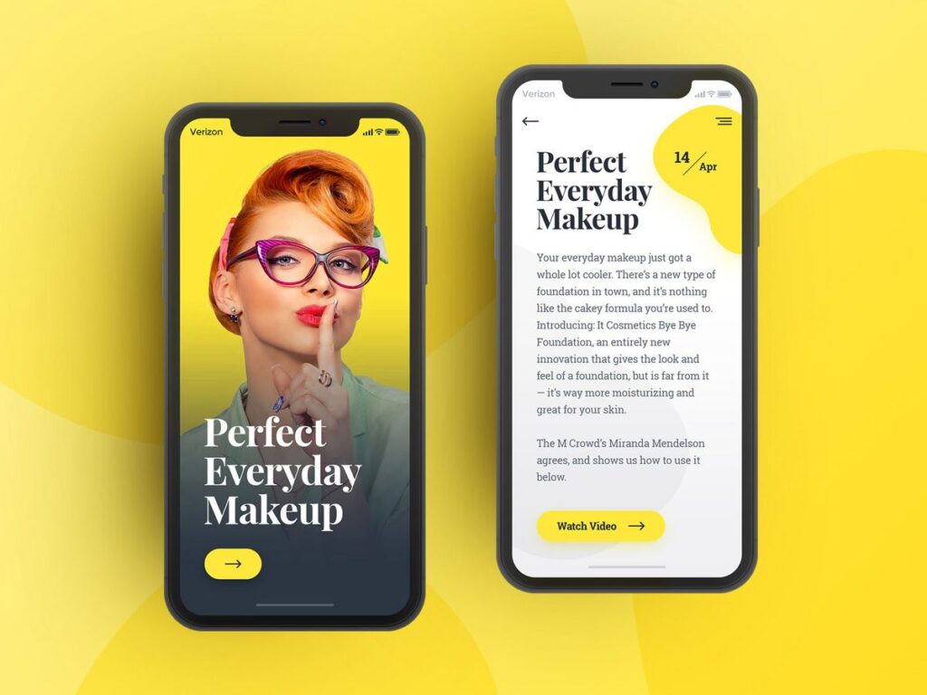
A strong mobile-first website loads quickly, even on slower connections. It uses clear, simple navigation, so visitors can find what they need in a few taps. Text and images are sized for smaller screens, and forms are easy to fill out without frustration.
Getting Started
If you’re not sure whether your current website meets these standards, it’s worth checking. A quick test on your own phone can reveal a lot, slow loading, awkward layouts, or hard-to-tap buttons are easy to spot once you know what to look for.
Ready to build a mobile-first website your customers will actually enjoy using? Get in touch with SyncPoint Media, or explore our web development services to see how we can help your business grow online.